
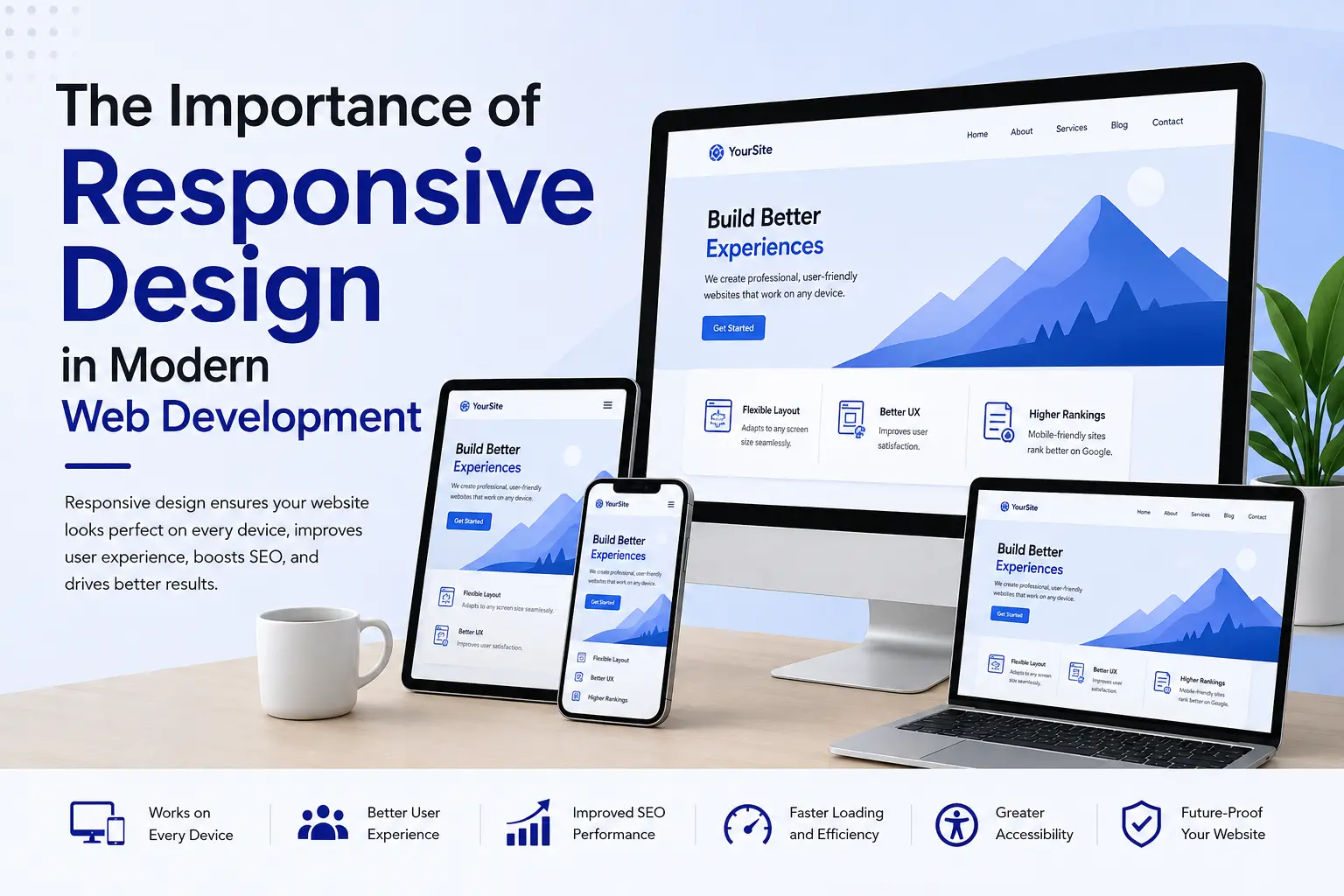
Responsive design in modern web development allows a website to adapt its layout, content, images, navigation, and interactive elements to different screen sizes and viewing conditions. Instead of creating a separate experience for every device, responsive web design uses flexible layouts and web technologies to deliver one site that can adjust across phones, tablets, laptops, desktops, and other screens.
Responsive design is now a core part of website development because visitors do not use the web from one fixed screen size. Modern CSS features such as Flexbox, CSS Grid, relative units, media queries, and responsive image techniques make it possible to create layouts that respond to available space rather than relying on fixed desktop dimensions.
For businesses, responsive design also affects practical areas such as usability, accessibility, page performance, content presentation, and search visibility. Google recommends responsive web design as a mobile-friendly configuration because it uses the same URL and HTML while allowing the presentation to adapt to the user’s screen.
What Is Responsive Web Design?
Responsive web design is an approach to building websites that adjust their presentation according to the available viewport and device environment.
A responsive website can change:
- Column layouts
- Navigation menus
- Font sizes
- Image dimensions
- Spacing
- Buttons and form controls
- Content positioning
- Video and embedded media
- Sidebars and other page elements
The goal is not to make every screen look identical. The goal is to preserve the content, functionality, and usability of the website while the layout changes to fit the available space.
Modern responsive development commonly combines CSS Grid, Flexbox, media queries, flexible sizing, and responsive images. MDN describes responsive design as a collection of practices for creating layouts that work across different device sizes and resolutions.
Why Responsive Design Matters in 2026
The need for responsive websites goes beyond making a page fit on a smartphone.
Google uses the mobile version of a website’s content for indexing and ranking through mobile-first indexing. Google also recommends responsive design as the easiest mobile-friendly configuration to implement and maintain.
That makes mobile presentation part of technical SEO rather than a separate design concern.
A responsive website also gives development teams a consistent foundation. With one URL and a shared HTML structure, businesses can avoid maintaining separate desktop and mobile pages in many common implementations.
| Area | Responsive Design Benefit |
|---|---|
| Mobile usability | Content adapts to smaller screens |
| SEO | Supports Google’s mobile-first approach |
| Accessibility | Helps content reflow across viewport sizes |
| Performance | Enables appropriate image and layout techniques |
| Maintenance | Reduces the need for separate device-specific pages |
| User experience | Keeps navigation and content usable across devices |
| Conversion paths | Makes forms, buttons, and calls to action easier to use |
For businesses working on organic search, responsive design should therefore be considered alongside other technical SEO activities. A useful starting point is this guide to SEO best practices for 2025.
Responsive Design and Mobile-First Development
Mobile-first development means starting with the constraints of a smaller screen and then expanding the layout when additional space becomes available.
This approach does not mean creating a mobile-only website. It means establishing a functional base layout first and progressively enhancing it for larger screens.
For example, a product page might use:
- One content column on a phone.
- Two columns on a tablet.
- A wider content-and-sidebar layout on desktop.
CSS media queries can apply styles when the browser environment meets defined conditions. Modern responsive development can also rely on flexible layout systems without creating a large collection of device-specific breakpoints.
The breakpoint should be selected based on where the content needs to change, rather than simply targeting a list of popular phone models.
Responsive Design Improves User Experience
A website may contain valuable information, but visitors still need to access that information without unnecessary friction.
On a small screen, a desktop layout can create problems such as:
- Horizontal scrolling
- Tiny navigation controls
- Text that is difficult to read
- Images extending beyond the viewport
- Buttons that are difficult to select
- Forms that require excessive zooming
- Content hidden behind unsuitable layouts
Responsive design addresses these problems by allowing page components to adapt to the available space.
For example, a three-column desktop layout may become a single-column mobile layout. A large navigation bar may become a compact menu. A wide comparison table may require a carefully designed responsive presentation.
The content remains available, but the interface changes according to the user’s environment.
Responsive Design Supports Accessibility
Responsive design and accessibility are closely connected because people may enlarge content, change browser dimensions, use different devices, or interact with websites under different viewing conditions.
WCAG 2.2 includes the Reflow success criterion, which requires applicable content to be presented without loss of information or functionality and without two-dimensional scrolling at a width equivalent to 320 CSS pixels.
Responsive layouts can support this requirement by allowing content to move into narrower columns.
Developers should pay particular attention to:
- Text reflow
- Keyboard navigation
- Focus indicators
- Touch targets
- Form usability
- Image alternatives
- Zoom behavior
- Contrast
- Navigation order
Responsive design alone does not make a website accessible. Accessibility requires broader testing against applicable requirements, but flexible layouts provide an important technical foundation.
Responsive Design and Website Performance
Responsive design can also influence performance when it is implemented with appropriate assets and layout techniques.
Large desktop images do not always make sense on smaller screens. Responsive image technologies can help browsers select suitable image resources for different display conditions.
MDN notes that responsive images and related techniques can help avoid serving unnecessarily large images to smaller devices.
Performance should also be measured using real-world metrics.
Google’s current Core Web Vitals include:
| Metric | What It Measures | Good Target |
| LCP | Loading performance | ≤ 2.5 seconds |
| INP | Interaction responsiveness | ≤ 200 ms |
| CLS | Visual stability | ≤ 0.1 |
These thresholds are evaluated at the 75th percentile of page visits.
Responsive design does not automatically produce good Core Web Vitals. A responsive site can still be slow because of oversized images, excessive JavaScript, poor server response times, render-blocking resources, or third-party scripts.
For practical optimization work, see this guide on how to improve your website’s speed for better SEO.
Responsive Images Are Part of Responsive Development
Images are common sources of layout and performance problems.
A responsive image implementation should consider:
- Image dimensions
- File size
- Compression
- Display size
- Device resolution
- Appropriate image formats
- Lazy loading where appropriate
- Reserved space to reduce layout movement
CSS can also prevent images from overflowing their containers. W3C documents techniques such as using max-width to help images fit within responsive layouts.
Google also recommends standard HTML image elements because they help search engines discover and process images.
This is particularly important for WordPress websites, where large media libraries can affect page performance if images are uploaded and delivered without optimization.
Responsive Navigation and Forms
Navigation needs to remain usable as the viewport becomes smaller.
A desktop navigation menu with many horizontal links may not fit comfortably on a phone. A responsive implementation can reorganize those links into a menu while keeping the site’s information architecture clear.
Forms require similar attention.
A responsive form should provide:
- Labels that remain associated with fields
- Inputs that fit the viewport
- Adequate spacing between controls
- Buttons that are easy to select
- Error messages that remain visible
- Logical field order
- Appropriate input types for mobile devices
The objective is not simply to shrink desktop elements. The interaction model may need to change when the available space changes.
Responsive Design and SEO
Responsive design is relevant to SEO because Google uses mobile-first indexing. Google recommends responsive web design and explains that it serves the same HTML and URL while changing how content is displayed according to screen size.
A responsive implementation can also simplify several SEO management tasks because desktop and mobile pages generally share the same URL.
Technical SEO still requires attention to:
- Crawlability
- Indexability
- Canonical URLs
- Structured data
- Internal linking
- Page speed
- Metadata
- Image optimization
- Content quality
For on-page implementation, use the ultimate guide to on-page SEO as a supporting resource.
Responsive design should be treated as part of the technical foundation rather than a substitute for complete SEO optimization.
Responsive Design and Local SEO
Local businesses also need responsive websites because users may search for services, locations, opening hours, directions, or contact information while using mobile devices.
A local business website should make important information easy to access on smaller screens, including:
- Business name
- Address
- Phone number
- Opening hours
- Service information
- Contact forms
- Location information
- Directions
Responsive design works alongside local SEO rather than replacing it. For a broader local search strategy, see how to optimize your website for local SEO.
How to Build a Responsive Website
A practical responsive development workflow can follow these steps.
1. Start With Content
Determine what users need to see and do before creating the visual layout.
Prioritize headings, navigation, primary content, forms, calls to action, images, and supporting information.
2. Create a Flexible Layout
Use CSS Grid, Flexbox, relative units, and flexible containers instead of relying on fixed page widths.
Modern CSS provides several layout tools designed for flexible interfaces.
3. Use Mobile-First Styles
Build the basic layout for a narrow viewport first. Add layout changes when the content requires additional space.
4. Add Responsive Images
Use image dimensions and responsive image techniques that suit the layout and device conditions.
5. Test Real Interactions
Resize the browser, test touch interactions, open forms, navigate menus, and inspect content at different zoom levels.
6. Measure Performance
Use tools such as PageSpeed Insights, Search Console, Chrome DevTools, and field data to identify performance issues. Core Web Vitals should be evaluated using real-user data where available.
7. Test Accessibility
Check keyboard access, focus behavior, zoom, text reflow, labels, contrast, and other applicable WCAG requirements.
8. Review After Launch
Responsive behavior should be tested after significant content, theme, plugin, or code changes because new components can introduce overflow, layout shifts, or interaction problems.
Common Responsive Design Mistakes
Several implementation problems can reduce the value of responsive design.
Using Fixed-Width Containers
A layout that assumes a single screen width can create horizontal scrolling on smaller screens.
Designing for Specific Devices
Building separate layouts for a long list of phone and tablet models can become difficult to maintain. Content-based breakpoints are often more practical.
Hiding Important Content on Mobile
Mobile users should not receive an incomplete version of important page content simply because the screen is smaller. Google recommends maintaining parity between mobile and desktop content for mobile-first indexing.
Oversized Images
A responsive container does not automatically mean that the image file is optimized.
Ignoring Zoom
A page that looks acceptable at its default size can still become difficult to use when text is enlarged.
Testing Only One Device
Responsive behavior should be evaluated across different viewport widths, browsers, input methods, and performance conditions.
Responsive Design vs. Adaptive Design
Responsive and adaptive design both address different display environments, but their implementation approaches differ.
| Responsive Design | Adaptive Design |
| Uses flexible layouts | Uses predefined layouts |
| Adjusts continuously to available space | Switches between selected layouts |
| Often uses CSS Grid and Flexbox | Often relies on defined layout states |
| Commonly uses one URL | Can use different implementation strategies |
| Works well across unknown viewport sizes | Requires more deliberate layout definitions |
The two approaches are not always mutually exclusive. Modern sites can combine responsive CSS with components that change behavior at specific layout conditions.
How Responsive Design Supports E-E-A-T
E-E-A-T stands for Experience, Expertise, Authoritativeness, and Trustworthiness.
Responsive design does not directly establish E-E-A-T. However, it can support the user-facing experience of a site that demonstrates these qualities.
For example, a professional website should make its author information, contact details, service information, references, and supporting content accessible across common devices.
Useful trust elements should not disappear or become difficult to access on mobile screens.
For a broader SEO perspective, explore the E-E-A-T optimization guide for 2025.
Tools for Testing Responsive Websites
Developers can use several established tools during responsive design testing.
Chrome DevTools: Useful for inspecting CSS, testing viewport sizes, debugging layouts, and examining performance.
PageSpeed Insights: Helps assess page performance using lab and field data where available.
Google Search Console: Provides search performance information and reports that can help identify technical issues.
MDN Web Docs: Provides detailed documentation for CSS layout, media queries, responsive design, and related web technologies.
For SEO workflows, you can also review the top SEO tools to boost your website’s ranking.
Frequently Asked Questions
What is responsive design in modern web development?
Responsive design is a web development approach that allows layouts, content, images, navigation, and interface elements to adapt to different viewport sizes and device conditions.
Why is responsive design important for SEO?
Responsive design supports mobile-friendly website implementation, and Google uses the mobile version of website content for mobile-first indexing. Google recommends responsive web design as a mobile-friendly configuration.
Is responsive design the same as mobile-first design?
No. Responsive design describes an approach in which a layout adapts to its environment. Mobile-first design is a development strategy that starts with the smaller-screen experience and progressively adds layouts for larger screens.
Does responsive design improve website speed?
Responsive design can support performance when it uses appropriate image sizes, flexible assets, efficient CSS, and suitable layouts. However, responsive design alone does not guarantee fast loading or good Core Web Vitals.
Does responsive design improve accessibility?
Responsive design can help content reflow across different viewport sizes. WCAG 2.2 includes requirements for reflow that address content presentation at narrow widths.
What CSS technologies are used for responsive design?
Common technologies include CSS Grid, Flexbox, media queries, relative units, responsive images, and flexible sizing functions. Modern CSS provides several ways to create layouts that adapt to available space.
Should every website use responsive design?
For most modern websites, responsive design is a practical approach because visitors can access sites from many viewport sizes. Google specifically recommends responsive web design as a mobile-friendly configuration.
How can I test whether my website is responsive?
Test the website across multiple viewport sizes, browsers, zoom levels, and interaction methods. Inspect horizontal scrolling, navigation, forms, images, text wrapping, and interactive elements. Performance and accessibility testing should also be included.
Conclusion
Responsive design in modern web development provides the foundation for websites that adapt to changing screen sizes without requiring users to work around fixed desktop layouts. CSS Grid, Flexbox, media queries, responsive images, and flexible sizing make it possible to build interfaces that respond to available space while preserving content and functionality.
For SEO, responsive design aligns with Google’s mobile-first indexing approach. For accessibility, responsive layouts can help content reflow at narrow widths. For performance, responsive assets can reduce unnecessary resource usage when implemented correctly. For businesses, the result is a website that can serve users across phones, tablets, desktops, and other viewing environments from a consistent web architecture.
The strongest implementation combines responsive layout techniques with accessibility testing, performance measurement, mobile SEO, structured content, and ongoing technical maintenance.